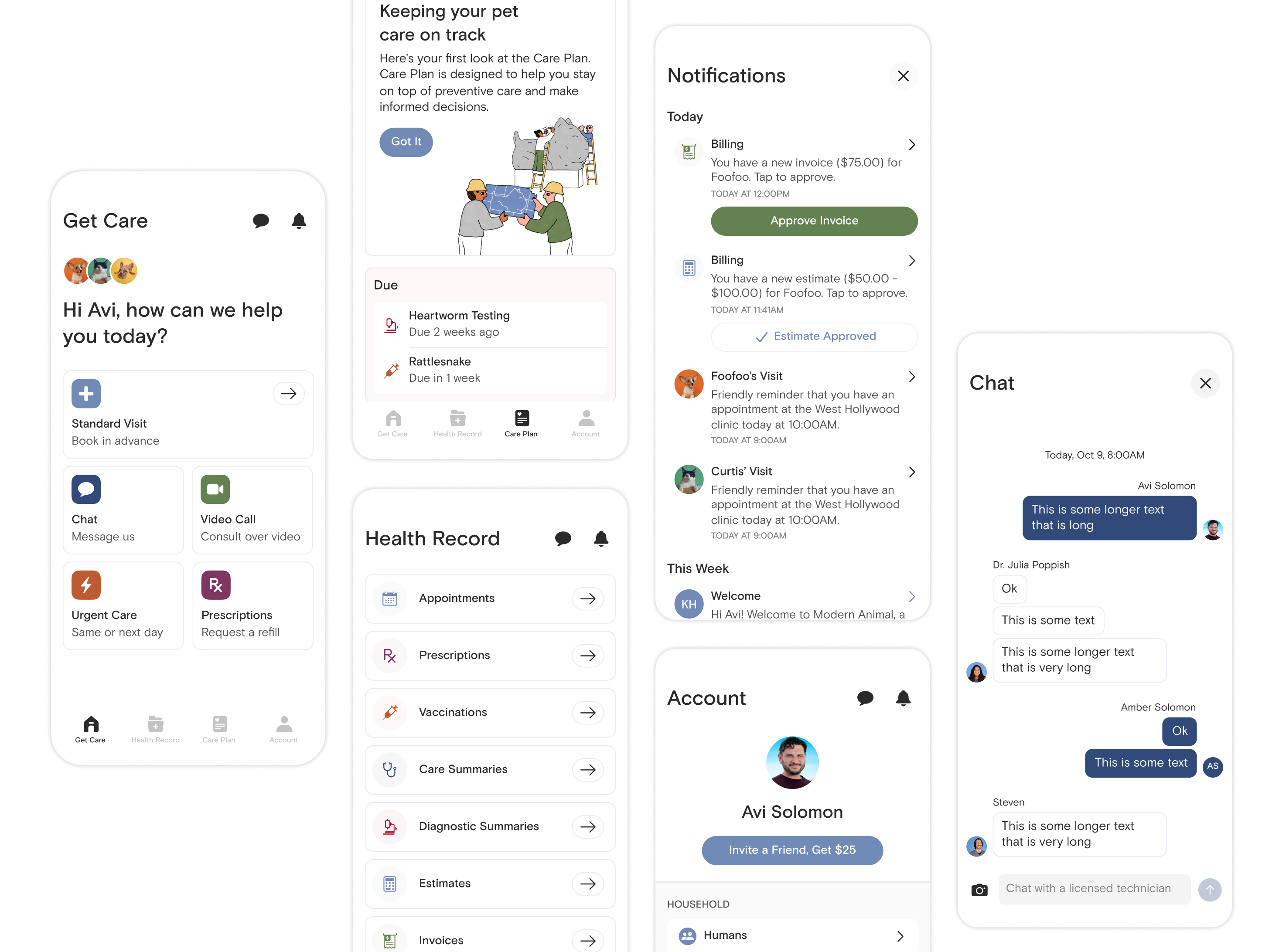
App 2.0 was a product initiative at Modern Animal, which included a complete redesign of our apps user interface and experience as well as an entirely new design system.
I led this redesign for 10 months from inception to production. For the first 6 of those months I worked on the project whenever I had the time - in between product cycles, on weekends, and after work. During the final months, I focused solely on this project, which included finalizing user flows, getting sign off from stakeholders on the look and feel of app, and going into the clinics for client feedback on prototypes.
Myself, Avi Solomon (Head of Product)
Research
• Take inventory of the current app by taking screenshots, dropping them in Figma, and mapping out existing user flows.
• Read through the user feedback channel in Slack. Document all of this in Notion by level of importance.
• Go into a couple of our clinics (West Hollywood & Pasadena) and talk to users. Keep it simple (at first) by asking big questions like "What do you like and dislike about the current app?", "What is something you wish the app had that it doesn't have now", etc. I like to keep initial user interviews simple and straightforward. Document all of this in Notion.
Ideation
• Rethink the information architecture. Question everything about the way the current app is set up.
• Gather feedback, iterate, and obtain sign off from stakeholders on the new IA. Success.
• Begin sketching, wireframing, and prototyping different layouts and user flows. Don't want to spend too much time here... I like to design in high fidelity.
Design
• Begin the visual work. This redesign would be heavily influenced by our rebrand. Lots of white space with black and grey text. Big text, when necessary. Bold splashes of color. Beautiful illustrations & iconography. Use lines liberally. I spent a lot of time here working with the brand team.
• Go back in the clinics and talk to users. Show them different high fidelity screens, layouts, prototypes, user flows, etc. Gather feedback. Iterate.
• Get sign off from stakeholders on the visual design of our main screens. Obtain sign off.
• Let the main screens influence the rest of the app. Then it is heads down from here on out to work out the user flows and remaining screens.
Implement, Gather Feedback, & Learn
• Work with the product manager and begin creating tickets in Jira.
• Finish designing the app. All user flows are fully documented and ready to hand-off to engineering.
• Attach the Figma files to each corresponding Jira ticket.
• Hand-off to engineering.
• Release the app.
• Get feedback.
• Continue iterating and building new features.
• An increase from 4.0 stars to 4.9 in the app store.
• Members and colleagues LOVED the new look and feel of the app.
• The new design system increased the speed at which we design and develop new features and screens (my favorite).
• Received employee of the year!