Overview
I worked on a three month contract for a business communications startup in downtown Los Angeles. The current design of the app felt dated and lacked key features in comparison to their desktop version. The goal would be to unlock those features, give the app a new look, and rethink the apps information architecture.
Role
Tools used
Goals
• Apply Apple's Human Interface Guidelines so the user immediately feels comfortable using the app on iPhone.
• Apply updated brand guidelines.
• Build a simple design system in Sketch.
• Use minimal design to reduce clutter.
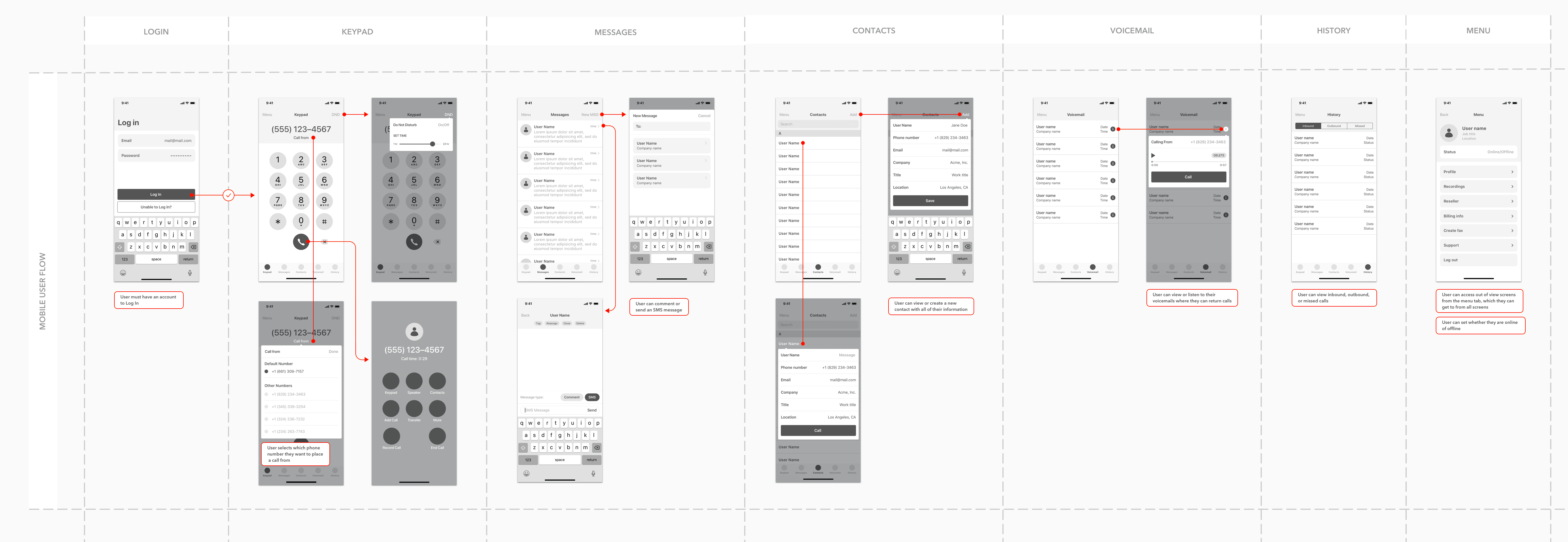
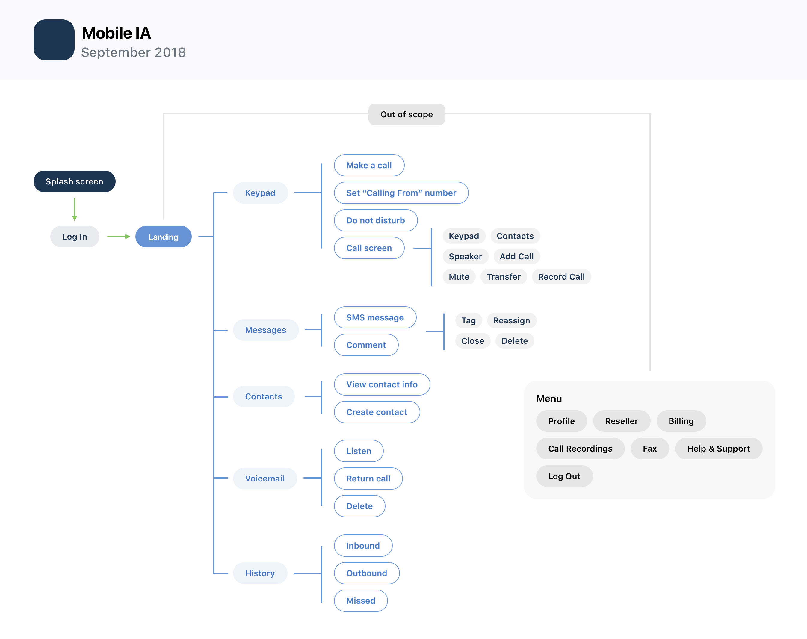
Establish a new IA
I spent the first week conducting an audit of the existing mobile application and learning about the business. After I had a solid understanding of the app and company goals, I began interviewing users. Together we determined that the app appeared overwhelmed by unnecessary features and UI thereby making it difficult to navigate. I presented my findings to stakeholders and was given the go ahead to craft an IA that better reflected user needs.
Brainstorm, wireframe, prototype
Following approval of the IA refresh, I began brainstorming and sketching out various layouts and ideas. This phase of the process didn't take very long, so I quickly transitioned to creating digital mocks in Sketch. After about a week of wireframing different screens and solutions, I started prototyping some user flows. I presented a mid-fidelity prototype to the stakeholders and let them play around with the prototype for the day, gathered their feedback, and made improvements to the UX.
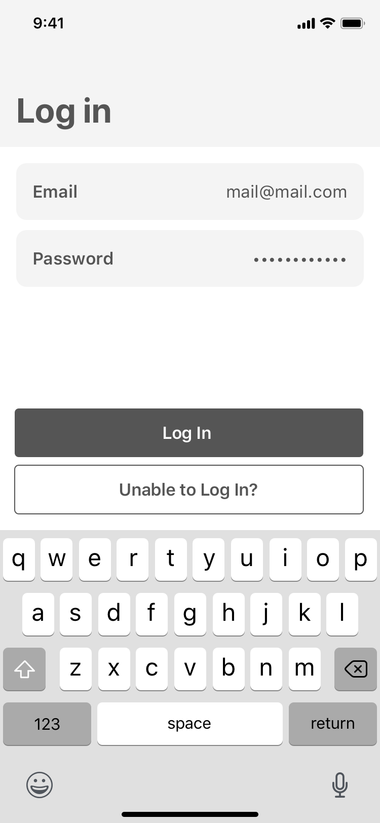
Log In
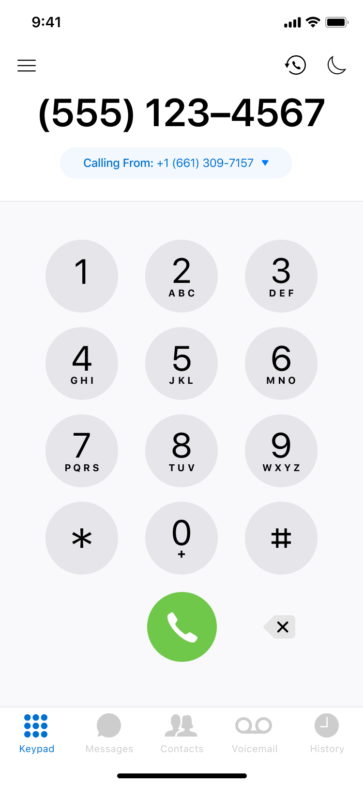
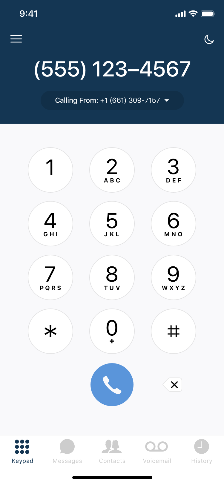
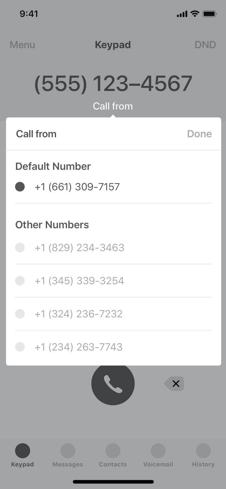
Keypad

Do Not Disturb

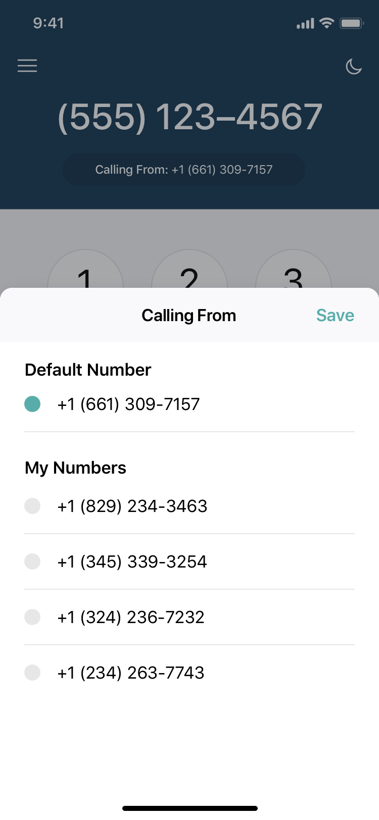
Call From
Call Screen

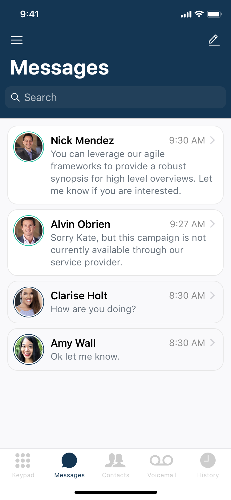
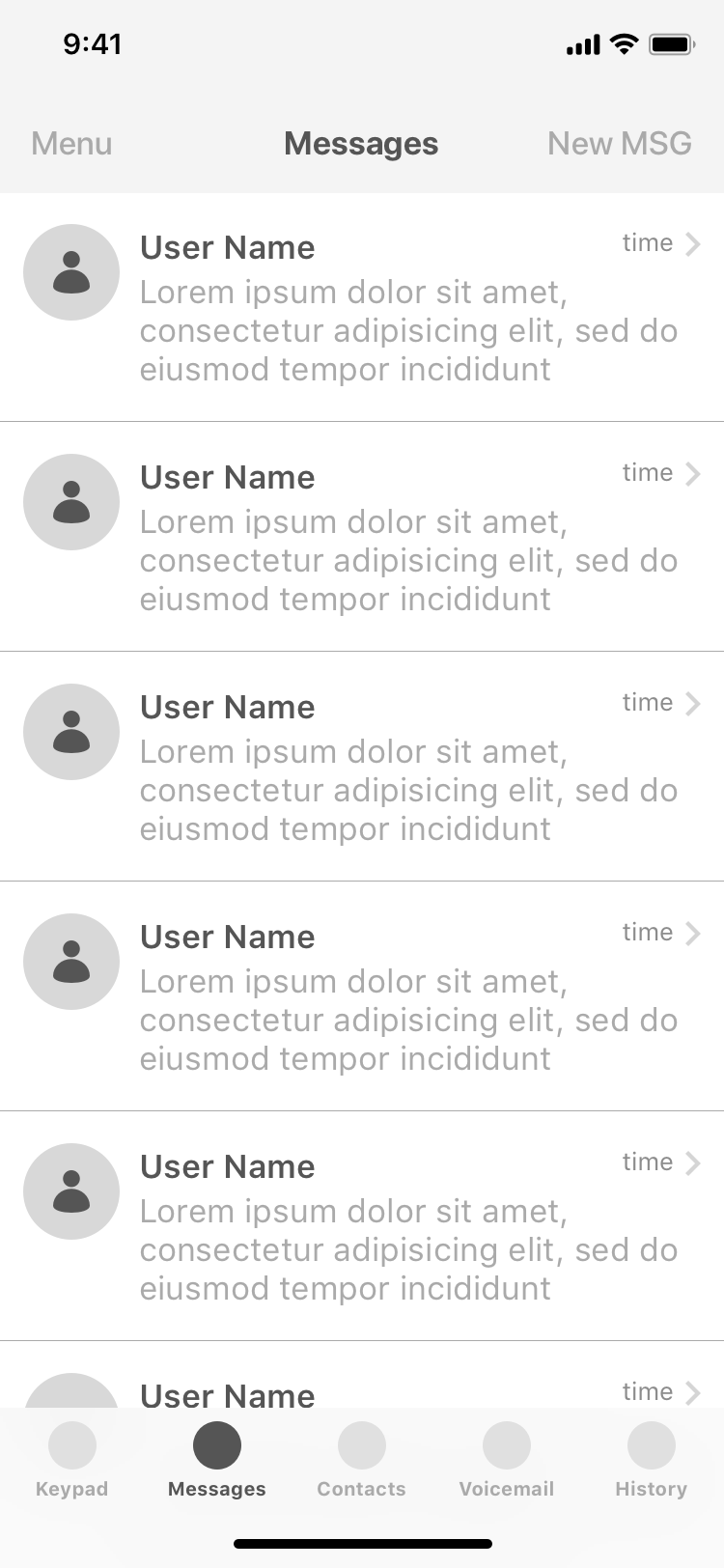
Messages
Message

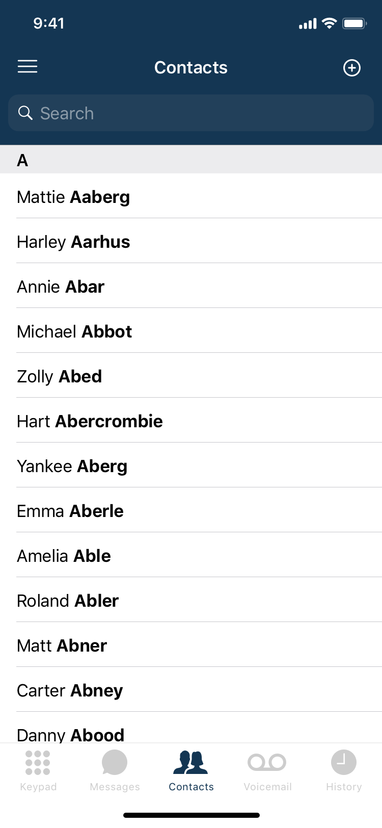
Contacts

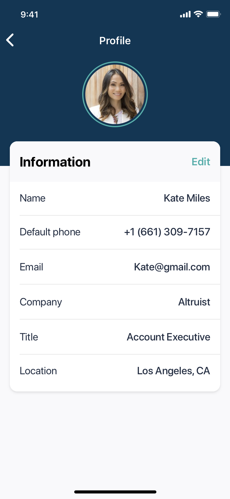
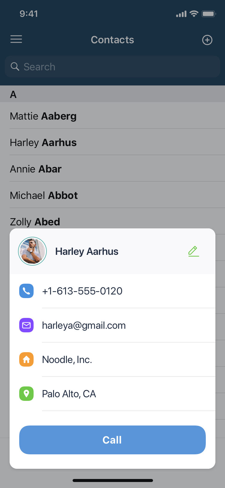
Contact Info

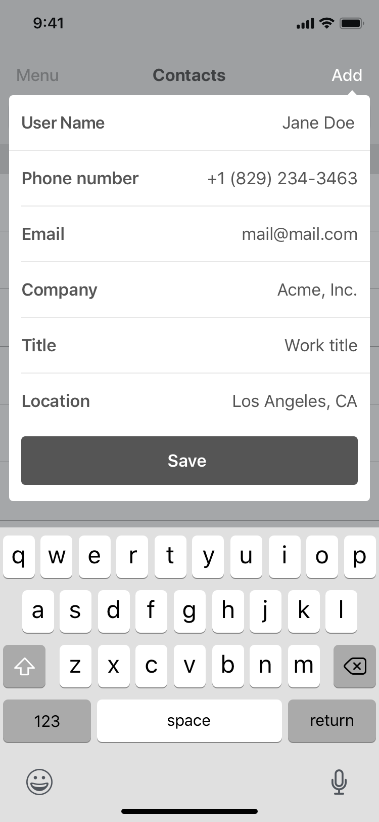
Add Contact
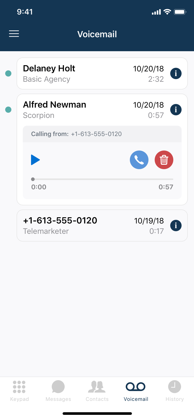
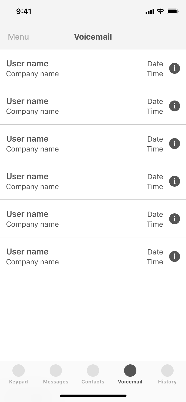
Voicemail
Voicemail Info

User testing
Before I went any further, I wanted to be sure that the solution I had come up with sat well with our users. So I sent the mid-fidelity prototype off to a few participants who had agreed to help with user testing. A couple days later, I conducted interviews of each tester, identified key user pain-points, and made a few corrections to the user flow.